


Here we are, mere mortal amateurs trying to create that desired stunning effect in our homes. We ended up many times that our choice of color scheme result in color clashes or simply being too bland. Let us discuss on some color schemes to shed some light on the best color combination for your home.
Personal taste plays a great role in your selection of colors. There is no right or wrong in your selections. How you use it, how you combine it and where you use it will need some considerations. For a more comfortable mood and ambience, harmonious color schemes should be used. It will be pleasant to the eyes and thus creating peace and tranquil within your home. If your choice of colors clashes, you will end up having mental stress all the time.
There are basically 3 types of schemes for different purposes within a home. They are the harmonious scheme, one-color scheme and contrasting scheme.
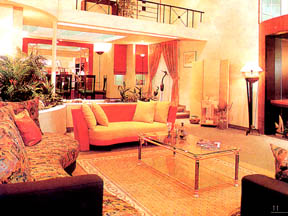
HARMONIOUS SCHEME: This is a selection of soothing blending colors. These colors shared a common color base. They practically flow into each other as in your color chart. For example, a clear blue, blue green, aqua and green will give you a much cooler effect whereas pink, apricot, peach and gold will give a warmer autumn-like effect. Using different textured material such as rugs, laces and brocade also play important role in this color scheme selection. It will make your room feel more grand and sophisticated.
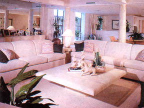
ONE-COLOR SCHEME: This is the safest and most practical selection to avoid the possibility of color clashes. Normally, white, off-white and grey are used in this selection. It allows you the chance of using small amount of an accent color to greater effect. Choices of warm off-white, cream, beige and brown will give you a warmer effect. Cool off-white, sky blue, blue-grey and royal blue give you a cool feeling. You can also add texture to the overall feel with area rugs, curtains and cushion cover. This color scheme is normally used in small rooms to give you the illusion of spaciousness.
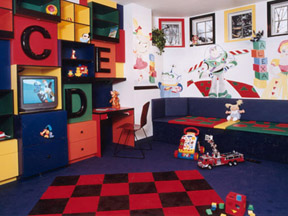
CONTRASTING SCHEME: This is the scheme that you used for rooms meant for fun, cheerful activities or entertainment, e.g. TV room, children play room, games room or even nursery room. It is useful for creating a vibrant and stimulating ambience. The colors could include deep purple with violet, navy blue with yellow ocre, orange with apple green and so on. Other add-ons could include cartoon based cheap rugs, reflective curtains and vibrant colored sofas.
I hope this rough guide will enable you to expand your creativity to explore more imaginative color schemes in the future.


1 comment:
my apartment at the moment is probably something between the one colour scheme and a contrast scheme... much of our furniture and wall and carpet is white... (sofa, tv shelf, light shades etc) but we have a bright yellow and red table and throw rugs and cushions also. really brightens the place and makes it alive :)
Post a Comment